Education and care services / 2020-2025
Happy Haven OSHC
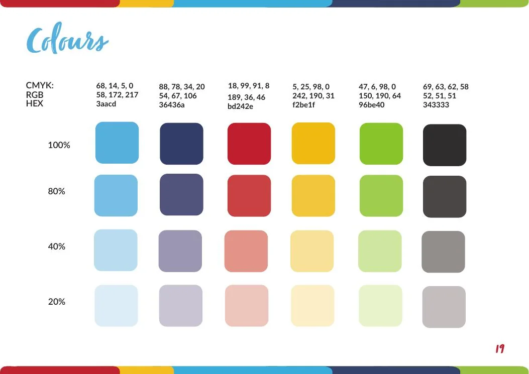
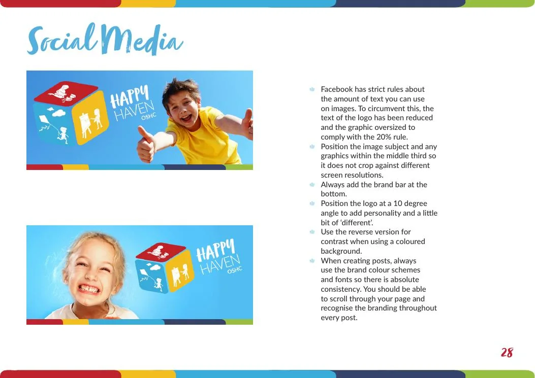
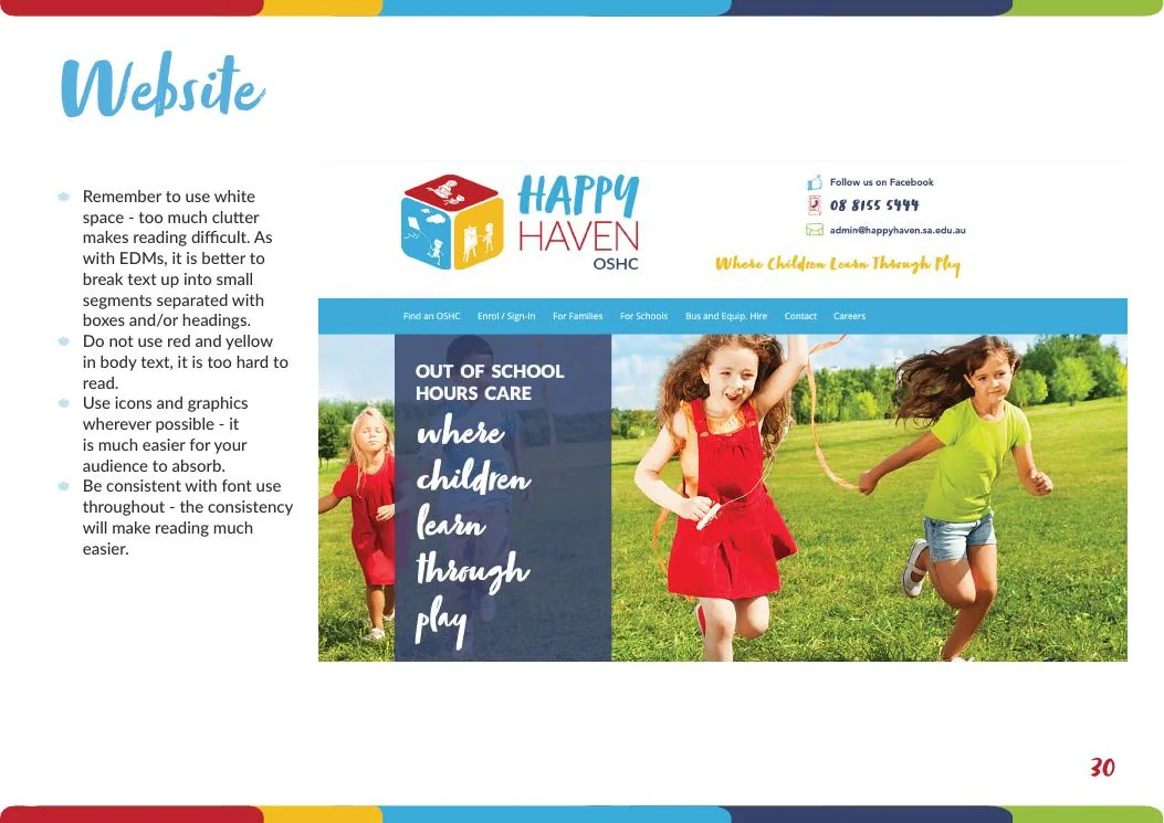
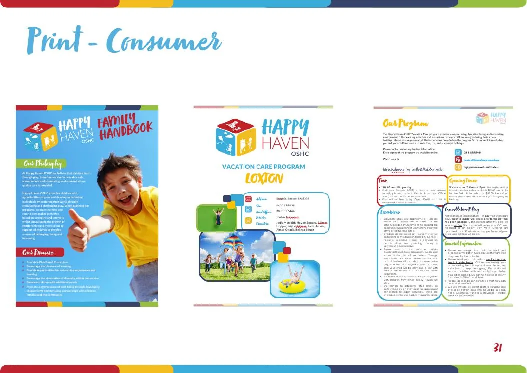
Reframing a large multi-site OSHC provider around a clear child-centred purpose, then applying the new brand across digital, social, print, service environments and internal communications.
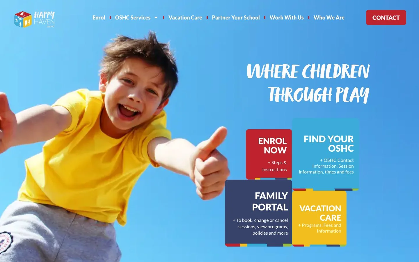
Before / After
From a functional identity to a complete brand system.
The earlier identity was recognisable, but it did not yet carry a clear organisational story or provide enough structure for a fast-growing, multi-site provider. The rebrand retained the familiar cube idea while building a far more expressive and usable system around it.
The challenge
What needed to change.
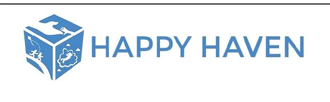
The organisation had grown quickly, while its identity and communications remained functional, inconsistent and heavily site-led. The brand needed to build confidence with families, schools and staff, and give a distributed service network one recognisable voice.
The work
How Sarah shaped the response.
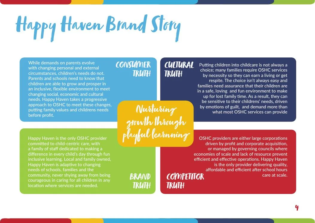
Sarah led company identity and brand strategy workshops, defined the brand hierarchy and developed the strategic narrative, values, voice, messaging and creative direction. The resulting brand book joined strategy and application in one practical system. She then led rollout across the website, social media, recruitment, parent communications, print collateral and service displays, while recruiting, training and remotely managing the communications team responsible for ongoing delivery.
The result
What the system made possible.
A coherent organisational brand that could scale across a growing network of services while remaining warm, practical and recognisable to families, school communities and employees.
Strategy and creative application in one brand book
Multi-site rollout across physical and digital touchpoints
Communications capability built inside the organisation
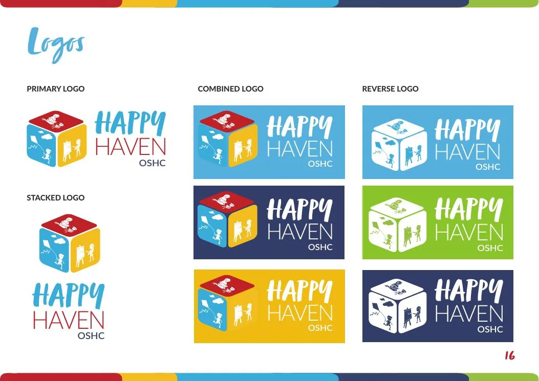
Identity at a glance
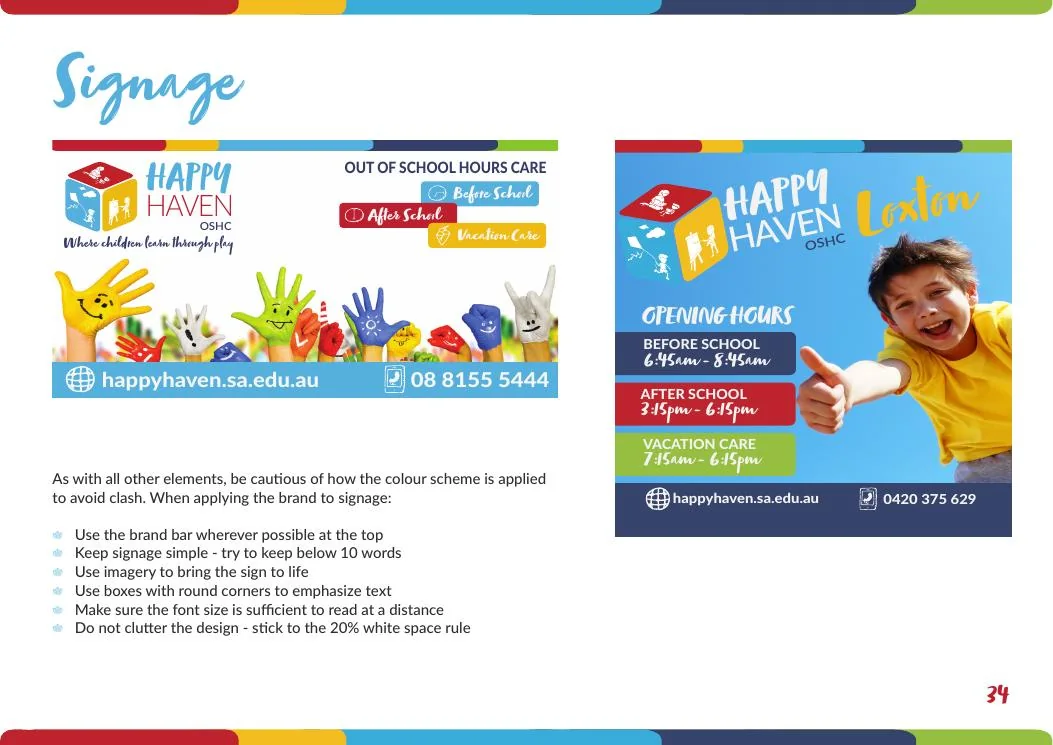
Selected applications
The brand in use.
The comparison shows the shift from a functional single-colour mark to a flexible identity system designed for digital, print and service environments.
Continue exploring
More portfolio projects

Mining and industrial services
Equip Mining Parts & Components
Building a new mining-parts brand from the ground up, then connecting its story, sales material, catalogue, ecommerce experience, ERP and CRM into one commercial system.
View project
Technology and hospitality
NightKey
Turning a complex identity-management product into a clear, trusted brand for venues, patrons and technology partners.
View project